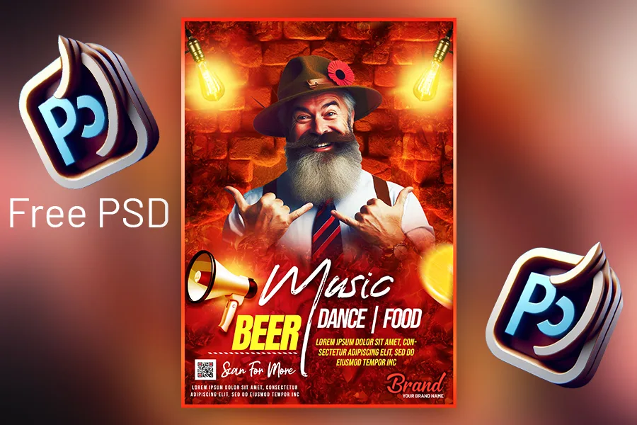
In the fast-paced world of events and parties, a well-designed music party poster can make all the difference in capturing attention and drawing a crowd. From vibrant colors and bold fonts to engaging imagery, every element of a poster should work together to reflect the mood and energy of the event. This guide will walk you through the essential steps to create an eye-catching music party poster, including tips on design and layout and a free PSD download to help you get started. Let’s get Started,
Before starting any kind of design. it’s very important to understand the theme of the music party and the target audience. Is it a retro disco, Hip-Hop night, or a live concert, the vibe of the party will inform every design, and choice, from colors and fonts to the imagery and overall. Consider the audience’s age, interests, and expectations to create a design that resonates.
Open Photoshop (Whatever version you have) and create a blank A4 page. create a background of the old wall using Microsoft Designer. Import it in Photoshop and create a custom background. You can create a character image with AI too. Move to the next part.
Color is one of the first things people notice in a design. Bold, bright colors tend to work well for music parties as they attract attention and convey energy. However, the color scheme should also match the type of music event:
Tip: Limit your color palette to three or four colors to keep your design clean and focused. Use contrast to make the poster readable from a distance.
Fonts are crucial in setting the tone of your poster. Use bold, readable fonts for the main headline, but don’t be afraid to mix it up with creative fonts for other text. Here’s a quick guide to choosing fonts based on the music genre:
Tip: Avoid cluttering the design with too many fonts. Stick to two or three different styles and use size and color to create a hierarchy.
Hierarchy is crucial in poster design to guide the viewer’s eye and make essential information stand out. Prioritize what information you want viewers to see first, such as the event name, date, time, and location. Place these elements in a logical order, often with the event name or theme at the top, followed by the date and time, then location, and any additional details.
Tip: Use larger fonts for the event title and subheadings to naturally draw attention. Play around with font size, weight, and color to emphasize the most important information.
Make sure to include all essential details like:
Tip: If there’s limited space, consider using icons for things like location (a map pin) or time (a clock) to keep the text concise and the design clean.
Balance is key to a visually appealing poster. Avoid overloading one side with too much information, and make sure there’s enough white space to keep the design from feeling cluttered. Divide your poster into sections if needed to create a structured layout.
Tip: Use grid lines to align elements. Centered layouts can create a classic look, while asymmetrical designs can be dynamic and eye-catching if balanced properly.
For a modern and professional feel, play around with layers and effects. Photoshop allows you to add shadows, glows, and gradient overlays that can make text and images pop. Experiment with blending modes to create unique effects, especially for backgrounds and overlays.
Tip: Don’t go overboard with effects; subtlety often works best. Use effects to enhance the design, not overshadow the main message.
Before printing or sharing online, review your design carefully. Check for any typos, ensure the layout looks balanced, and confirm that all essential details are included. Share the design with a friend or colleague to get feedback before finalizing it.
Creating a music party poster that grabs attention and conveys the right mood doesn’t have to be complicated. By following these tips and using the provided free PSD template, you can design a poster that not only looks professional but also effectively promotes your event. Remember, every element in your design should work together to tell the story of the event and draw the right crowd.
Whether you’re designing for a hip-hop night, an EDM rave, or a rock concert, these principles will help you create a poster that captures the essence of your music party.
If you’re new to poster design or need inspiration, using a PSD template can be a great starting point. We’ve provided a free PSD download to help you jumpstart your design. Customize colors, text, and images to make the poster uniquely yours.
| Software Compatibility | Adobe Photoshop |
| Printable | Yes |
| Fonts Used | Font_1 : Reey Font_2 : Anton Font_3 : Astrea Font_4 : &Matchmaker Font_5 : Bebas Neue |
| File Format | PSD (Photoshop) |
| File size | 80 MB |
| Dimensions | 8.26 * 11.69 Inches |
| Color Mode | RGB |
| Resolution | 300 DPI |
| Download file type | rar file |
| PSD Type | Only Poster design, PSD |
| Mockup | No |
| License | Free for personal and commercial use |
Copyright Disclaimer:: You are welcome to use these templates for personal or business purposes, but giving credit to Festybay is mandatory. Most of the materials are provided for educational purposes and are intended for non-profit use. If you believe any content violates your copyright, please contact us at contact@festybay.com or on WhatsApp at +91-8637840669. We will take prompt action to remove the content in question.
Table of Contents
Toggle