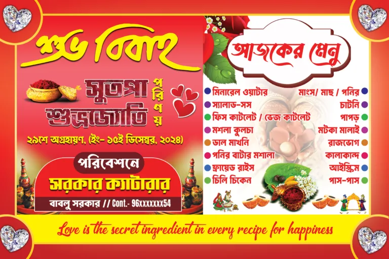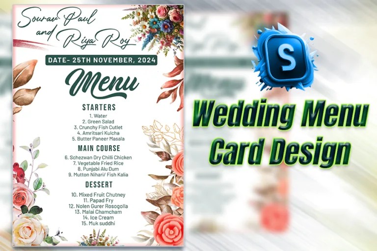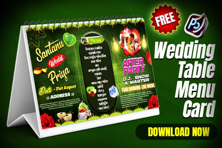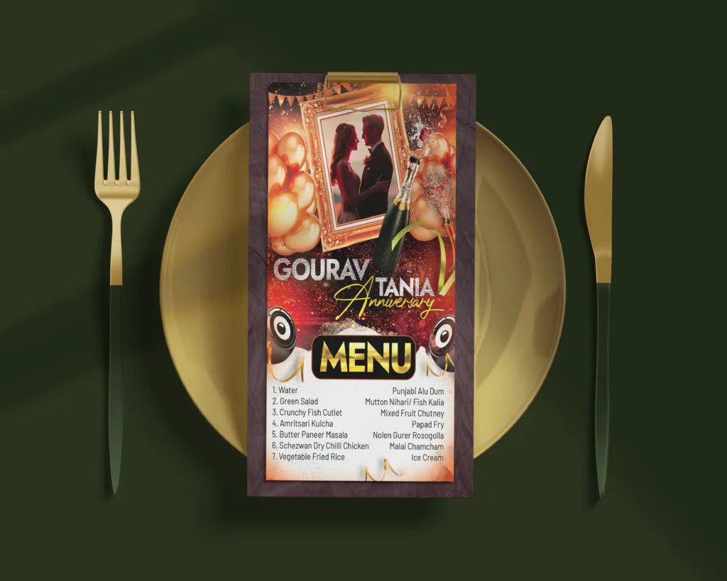
Wedding anniversaries are special milestones worth celebrating. Whether it’s the golden 50th, the silver 25th, or the first anniversary, a well-designed event poster can beautifully convey the importance of the occasion. In this guide, we’ll walk you through designing a high-quality wedding anniversary event poster using Photoshop.
Why a Beautiful Event Poster Matters
A wedding anniversary poster is more than just an announcement; it sets the tone for the celebration. The design reflects the couple’s mood, theme, and personality, ensuring that guests feel excited and welcomed.
Step 1: Choose a Theme and Color Palette
Every great design starts with a theme. For wedding anniversaries:
- Gold and white work wonderfully for 50th anniversaries.
- Silver and blue create a sleek look for 25th anniversaries.
- Pastels are perfect for more modern, intimate celebrations.
Pro Tip: Incorporate elements that reflect the couple’s journey, such as floral motifs, wedding rings, or their favorite colors.
Step 2: Select the Right Fonts
Typography plays a huge role in Event poster design. Use fonts that resonate with elegance and celebration. Serif fonts like Playfair Display or Great Vibes exude sophistication. Sans-serif fonts like Open Sans or Lato ensure readability.
Step 3: Collect and Prepare Visual Assets
Use high-quality images to elevate your Event Poster design. Popular options include.
Step 4: Design the Layout
Highlight the type of event—e.g., “John & Mary’s 25th Wedding Anniversary. Ensure it’s visible. Add something unique, like “Join us for an evening of love, laughter, and memories.
Step 5: Create the Event Poster Design
Go to File > New and set the size to A4 or custom dimensions (e.g., 1080px x 1920px for social media). Use a resolution of 300 DPI for print quality. Choose a gradient, texture, or subtle floral pattern. Keep the background understated so the text stands out. Use smart objects to insert photos for easy resizing without losing quality. Overlay elegant frames or borders to highlight images. Position the event title prominently at the top. Add secondary information (date, time, venue) in a neat hierarchy.
Step 6: Polish the Event Poster Design
Ensure the text is legible against the background. Keep elements centered or aligned to create balance. Adjust hues and brightness to maintain harmony. Add subtle highlights like bokeh effects or sparkles for a magical touch. You can use AI to generate new images for your event poster designs. Just how we create an image using Leonardo Ai.
Step 7: Export and Share
For print: Export as a high-quality PDF or JPEG. For social media: Optimize the file size and export it as PNG. Use platforms like Canva or mockup tools to showcase your design on invitations, flyers, or digital screens.
Free PSD Event Poster Template for Wedding Anniversary
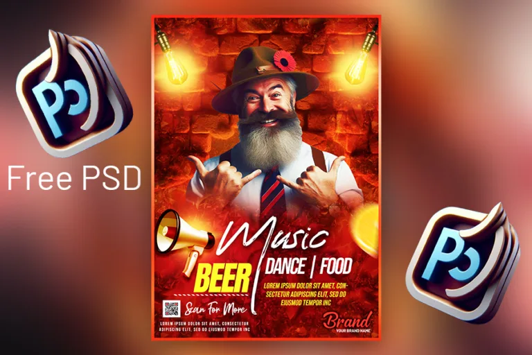
We’ve got you covered! Download a free PSD template designed specifically for wedding anniversaries. This file is fully customizable, allowing you to tweak the colors, text, and layout to fit your event perfectly.
Copyright Disclaimer:: You are welcome to use these templates for personal or business purposes, but giving credit to Festybay is mandatory. If you believe that any content violates your copyright, please contact us at contact@festybay.com or reach us on WhatsApp at +91-8637840669. We will take prompt action to remove the content in question.
More PSD designs
Recent Posts
Table of Contents
Toggle

