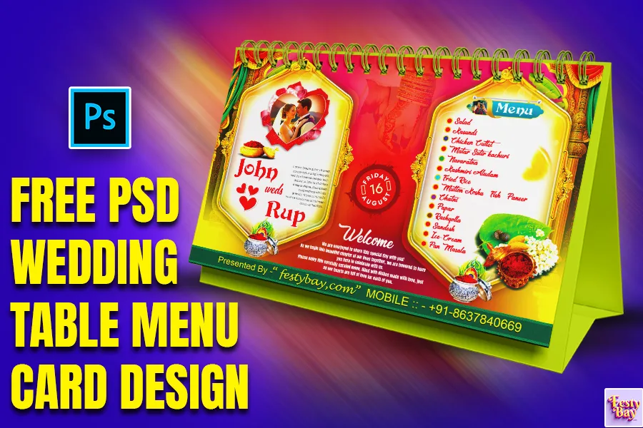
A wedding Menu card is more than just a list of dishes-it’s a small piece of your wedding’s overall design and a personalized touch that makes each guest feel cherished. The 9×6-inch menu card is perfect: big enough for detailed information but compact enough to blend elegantly with your table decor. In this guide, we’ll walk you through the steps of designing a wedding menu card that is both practical and beautiful, leaving a lasting impression on your guests. Let’s get started.
For every design concept planning is a must. A design like a wedding menu card you can’t take a chance. Your wedding menu card should align with your wedding’s theme, colors, and atmosphere. For example:
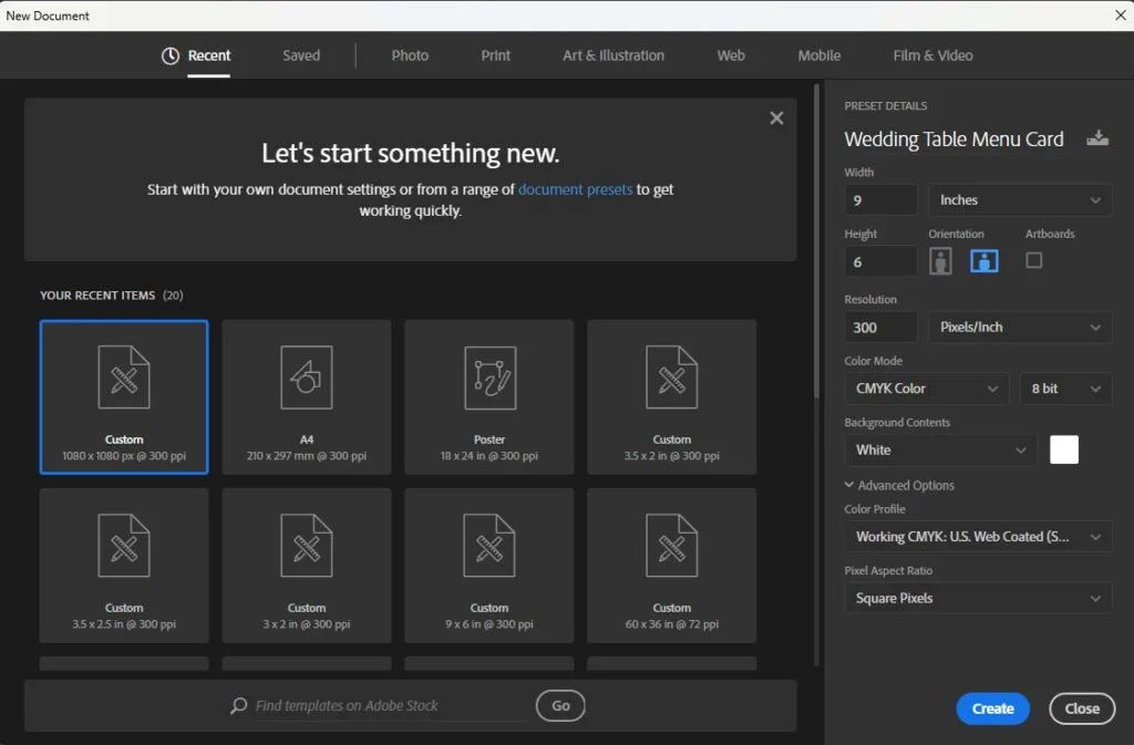
We will set up the page now in Photoshop, follow the following steps- go to file> New > Select 9-inch width, 6-inch height > color code CMYK( for printing purposes), and you can choose RGB for digital purposes. > Set the resolution to 300DPI (for high-quality print).
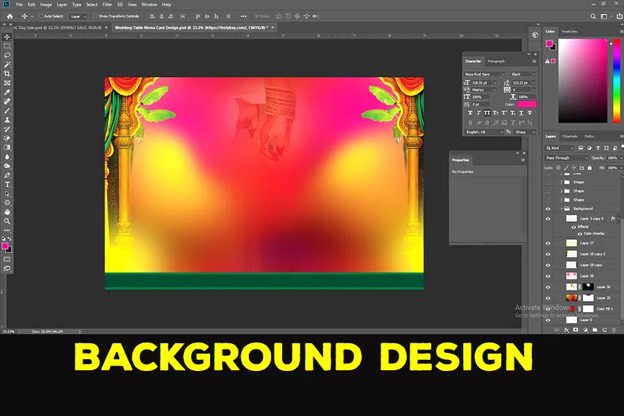
A custom background can add a unique layer of depth and personalization to your wedding menu card design. Instead of plain, solid colors, a well-designed background can enhance your theme and bring elegance to the menu. Here’s how to create a stunning custom background that elevates your menu card’s overall look.
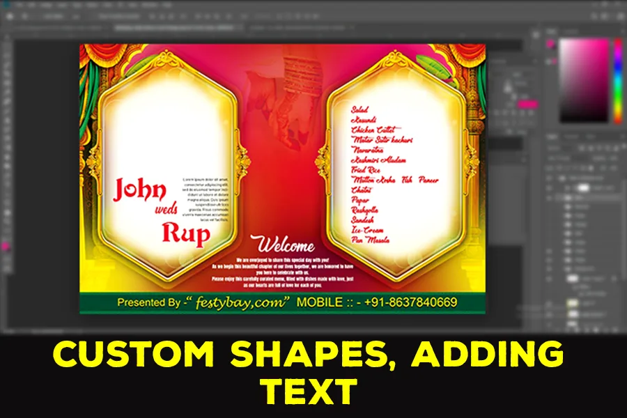
Fonts play a significant role in setting the tone of your menu card. Generally, pairing a beautiful script font for headings with a readable serif or sans-serif font for body text creates a balanced look. Popular choices for a refined look include fonts like Garamond, and Baskerville, or a graceful script like Dancing Script. Keep in mind:
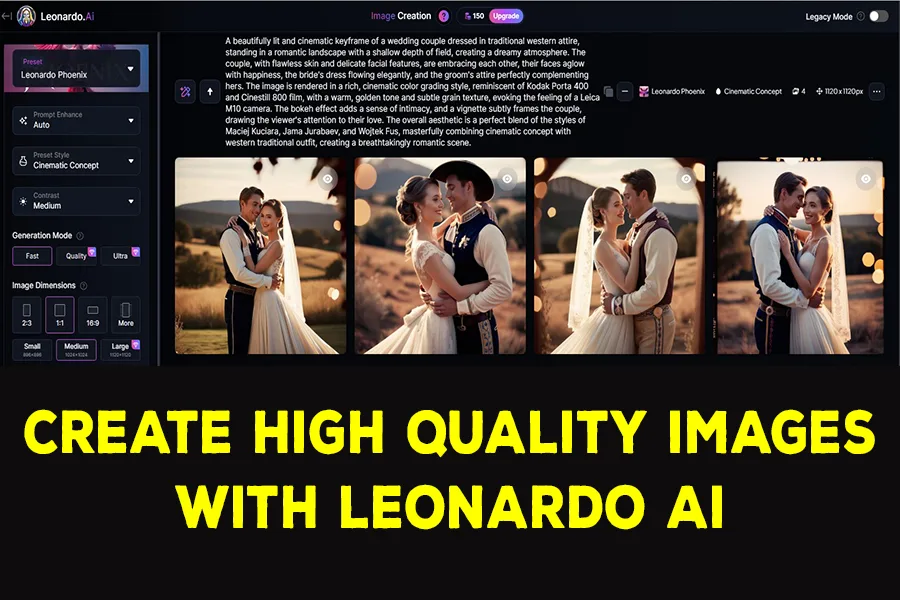
To add some custom high-quality images we used Leonardo Ai. We added the custom prompt, given below here.
Prompt- “A beautifully lit and cinematic keyframe of a wedding couple dressed in traditional Western attire, standing in a romantic landscape with a shallow depth of field, creating a dreamy atmosphere. The couple, with flawless skin and delicate facial features, are embracing each other, their faces aglow with happiness, the bride’s dress flowing elegantly, and the groom’s attire perfectly complementing hers. The image is rendered in a rich, cinematic color grading style, reminiscent of Kodak Porta 400 and Cinestill 800 film, with a warm, golden tone and subtle grain texture, evoking the feeling of a Leica M10 camera. The bokeh effect adds a sense of intimacy, and a vignette subtly frames the couple, drawing the viewer’s attention to their love. The overall aesthetic is a perfect blend of the styles of Maciej Kuciara, Jama Jurabaev, and Wojtek Fus, masterfully combining cinematic concept with Western traditional outfit, creating a breathtakingly romantic scene.“
Once you’ve designed your custom background, using adjustment layers like Brightness, Contrast, and Highlights can refine your design and make it look polished and professional. These adjustments allow you to control the mood, readability, and color balance of your background, ensuring that your menu card’s final look aligns perfectly with your wedding aesthetic. Here’s how to make the most of these finishing touches:
Increase Brightness: Lightening your background slightly can create a soft, airy feel that suits elegant or romantic wedding themes. It’s also great for maintaining a light and neutral base, allowing darker text to stand out.
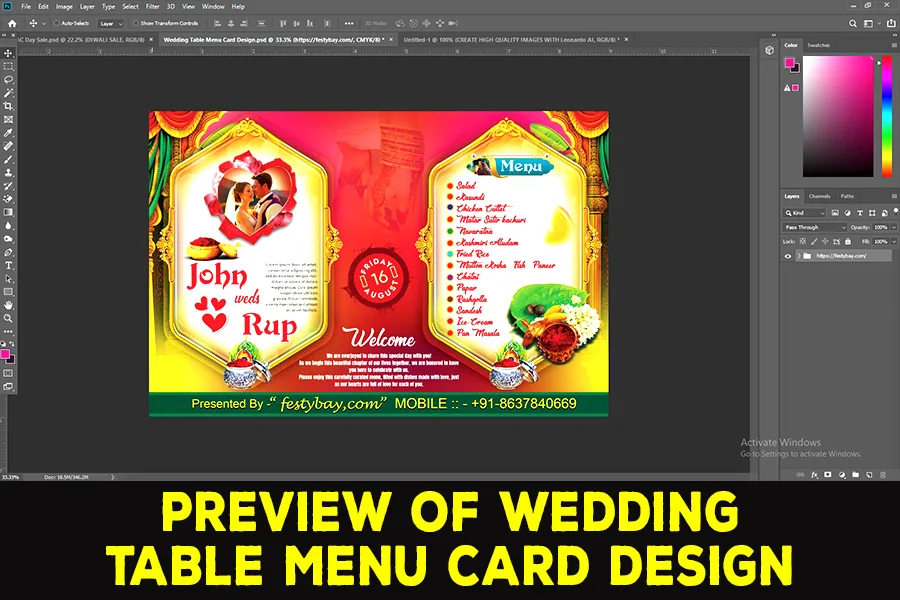
| Software Compatibility | Adobe Photoshop |
| Printable | Yes |
| Fonts Used | Font_1: Barlow Font_2: Anton Font_3: Devinne Swash Font_4 : &Matchmaker |
| File Format | PSD (Photoshop) |
| File size | 44 MB |
| Dimensions | 9 x 6 Inches |
| Color Mode | CMYK |
| Resolution | 300 DPI |
| Download file type | rar file |
| PSD Type | Wedding Table Menu Card design, psd |
| Mockup | No |
| License | Free for personal and commercial use |
Copyright Disclaimer:: You are welcome to use these templates for personal or business purposes, but giving credit to Festybay is mandatory. Most of the materials are provided for educational purposes and are intended for non-profit use. If you believe that any content violates your copyright, please contact us at contact@festybay.com or reach us on WhatsApp at +91-8637840669. We will take prompt action to remove the content in question.
Table of Contents
Toggle