Creating a visually striking event poster design can make all the difference in successfully promoting an event. Whether you are working on a music festival, corporate conference, or local community gathering, a well-designed poster helps capture attention and set the right tone for your audience. In this, we will go through a step-by-step guide on how to design an Event Poster design, as a bonus festybay.com offers a free PSD event Poster design to download and customize, fully editable.
A well-designed event poster is more of a promotional tool- it’s an experience. It can set the mood, convey the important details, and make your event memorable. Think about the posters that have caught your eye in the past, they are bold, easy to read, and look professional, right? Whether you are creating a poster for social media or printing it for flyers, it’s important that your design stands out and delivers your message.
No more wasting time, let’s jump into Photoshop ( whatever version you have).
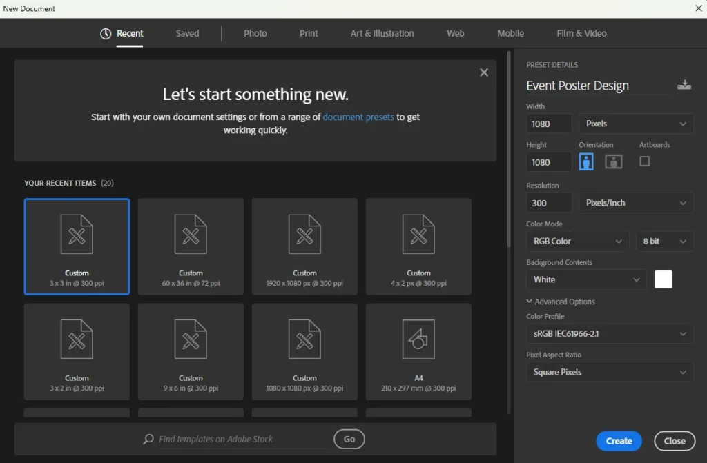
The first step in creating your Poster for any purpose, it’s important to clear the concept and design in your mind first. Then the very next step is to set up and create a new canvas for Event Poster design.

Before you start dragging the colors, just for a minute decide on the Title and subtitles. What’s the most important piece of information? Most likely, it’s the name of the event. Other key elements to include are:
Now it’s time to Choose the background color. Always choose the colors that match the Vibe. For a fun, lively event like a music festival, go for bright, bold colors. Not sure where to start? Tools like Adobe Color can help you find the perfect color palette that works together.
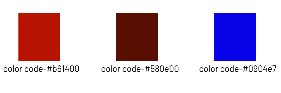
We choose the “Dark Maroon” color ( Color code-b61400). For better visuals and easy to understand we added the color bar below, with color.

For better high-quality images we use Leonardo AI. it’s better to think creatively and generate some unique and relevant images for your Event poster Design. You can try our prompt –
you can use this same simple prompt to generate the same images just like us. Hope you got the idea, now after generating the image import the image directly into Photoshop. For better enhancement, we made some changes like adjusting the saturation, Hue,vibrance, and also brightness and contrast to match the vibe background.
When it comes to Posters, social media posts, heading/ typography is everything. It’s not about choosing the cute fonts-your needs to be readable and work well with your layout by choosing a blood font. Subheadings like the date, time, and location can be smaller but still easy to read.
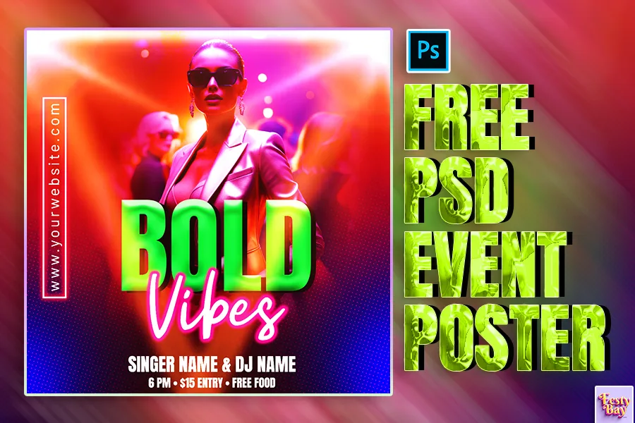
Just like our PSD template to give an atmosphere vibe with Evnet’s purpose, we highlighted “Bold” as the main heading ( Font use- Anton) and “vibes” as the subheading (Font use- Astrea).
After doing all the above things we added some highlighted elements to brighten it and to give a more colorful look. You can add some bright colors like Magenta and cyan to enhance, but in this event poster design, we added light flares.
After everything looks perfect, it’s time to save your work:

| Software Compatibility | Adobe Photoshop |
| Printable | Yes |
| Fonts Used | Font_1: Barlow Font_2: Anton |
| File Format | PSD (Photoshop) |
| File size | 18 MB |
| Dimensions | 1080 x 1080 pixels |
| Color Mode | RGB |
| Resolution | 300 DPI |
| Download file type | rar file |
| PSD Type | Only Poster design, psd |
| Mockup | No |
| License | Free for personal and commercial use |
Don’t have time to start from scratch? I’ve got you covered! You can download this free PSD event poster design that’s already set up for you. All you need to do is plug in your details, tweak the colors, and you’re good to go!
Copyright Disclaimer:: You are welcome to use these templates for personal or business purposes, but giving credit to Festybay is mandatory. Most of the materials are provided for educational purposes and are intended for non-profit use. If you believe that any content violates your copyright, please contact us at contact@festybay.com or reach us on WhatsApp at +91-8637840669. We will take prompt action to remove the content in question.
Table of Contents
Toggle